A little
out of
line.
Our little kitchen borrows its shape from a 1950s cooker. We’re borrowing something from risograph printing too: the patience to make it slowly, carefully, one layer at a time.
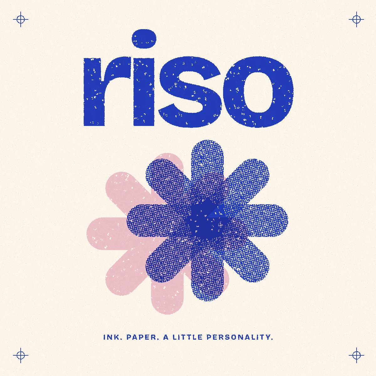
On print, play & patience
If you look closely at the kitchen illustrations around this site, you’ll see dots in the shadows and colours that don’t quite line up, with a bit of paper showing through.
That’s our nod to risograph printing. I wanted the drawings to have some of the warmth and character I’m working towards in the furniture. Riso’s colour and texture caught my eye first; the care that goes into building an image a layer at a time made me want to look closer.
It might seem an odd place to look for ideas for a children’s furniture brand. The machine behind those prints was built to make copies of everyday documents, and its story goes back to a small print shop in Tokyo.
It started in
a Tokyo print shop.
In 1946, Noboru Hayama set up a small mimeograph printing business in Tokyo. He called it Riso-sha; riso means “ideal”. In 1954, the company began selling its own emulsion ink after developing it for the print shop.[1]
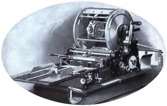
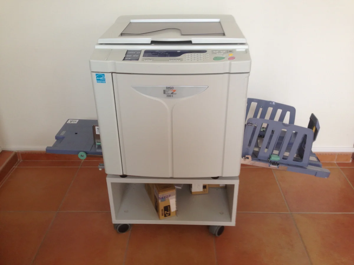
The process grew out of stencil duplicating, where ink is pushed through openings in a stencil onto paper. RISO’s 1958 RISO-GRAPH was an earlier mimeograph device. The RISOGRAPH office printing system followed in 1980, with separate machines for making the stencil, called a master, and printing from it.[2][3]


- 1946
A small print shop in Tokyo.
- 1958
The earlier RISO-GRAPH stencil device.
- 1980
The RISOGRAPH system arrives.
- 1984
The 007 brings master-making and printing together.
By 1984, the RISOGRAPH 007 put those jobs in one machine, and a digital model followed in 1986. These were machines for making lots of copies of things like school worksheets and office documents.[3]
They also turned out to be lovely tools for making art. Studios such as Glasgow’s RISOTTO, established in 2012, use riso for art prints and colourful stationery.[7] The overlapping colours and dotted shadows that caught my eye come from the way the machine works.
One colour.
Then another.
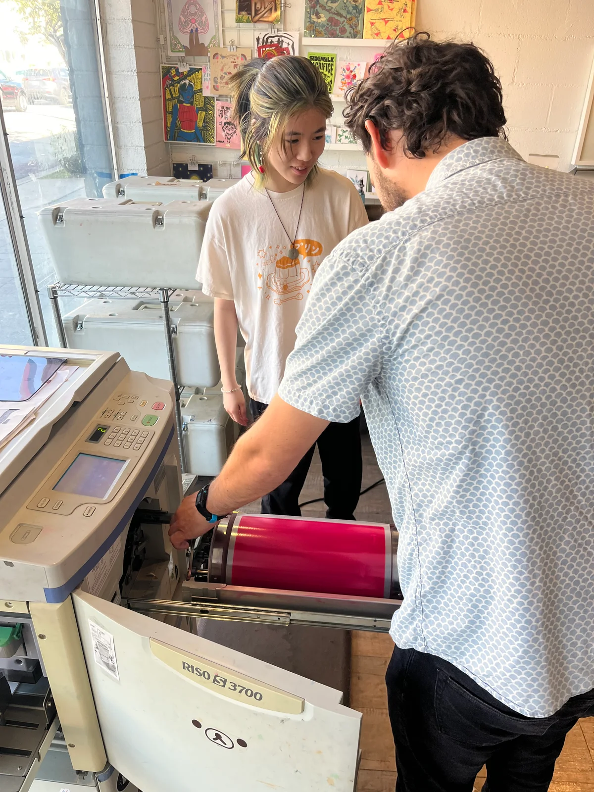
A Risograph looks much like a photocopier, but it prints through a stencil. The machine makes tiny openings in a thin master and wraps it around an ink drum. As the drum turns, ink passes through those openings onto the sheet.[4]
Each colour needs its own master and ink drum. On a single-drum machine, you print one colour, change the drum and feed the sheets through again. Two-drum models can put down two colours in one pass.[6]
The machine is quick once it’s running. Much of the slower work happens around it: preparing the layers, choosing the inks and paper, and checking how they come together. Drying time is part of the job, too.[5]
I like that there’s still so much for the person at the machine to decide. A colour can need another look on the actual paper, and a small adjustment can change how the whole print feels.

Inside the
machine.
- The master
Openings in the stencil let the ink through.
- The drum
Each drum holds one colour of ink.
- The paper
The sheet passes through again for the next colour.
Where the colours meet.
Most riso inks are translucent, so when you print one over another, both colours show through. This is called overprinting, and the overlap gives you a third tone without needing another ink.[5]
I like how much you can get out of just two inks. You can try it below by moving the pink and blue circles together, then looking at each colour on its own.

The two inks make a third colour where they overlap.
The edge gives it away.
Registration is how well the layers line up. A sheet can land a little differently on its next trip through the machine, leaving a coloured fringe around a shape or a sliver of paper between two blocks.[6]
Printers work carefully to control that movement, though I rather like a small slip at an edge. Even within the same run, those little differences can give each print a character of its own.
Try moving the red layer below and see where you like it, or bring the crosses together to line everything up.
The crosses help you see how the two layers line up.
How dots
become shadows.
A single ink can make a whole range of tones. In a halftone screen, small dots leave more paper visible; larger dots cover more of it. From a little further away, your eye reads the pattern as a lighter or darker shade. Riso can also use a grain-like dither instead of a regular dot screen.[5]
That’s how we draw the shadows on our kitchen illustrations. I like being able to see the dots up close, then having them settle into a shadow as you move away.
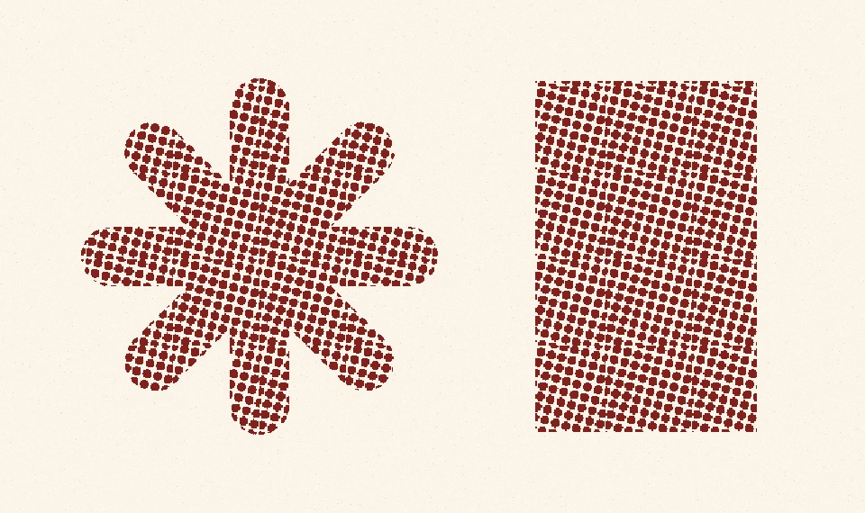
Up close, a shade becomes a pattern.
A few decades apart.
A lot in common.
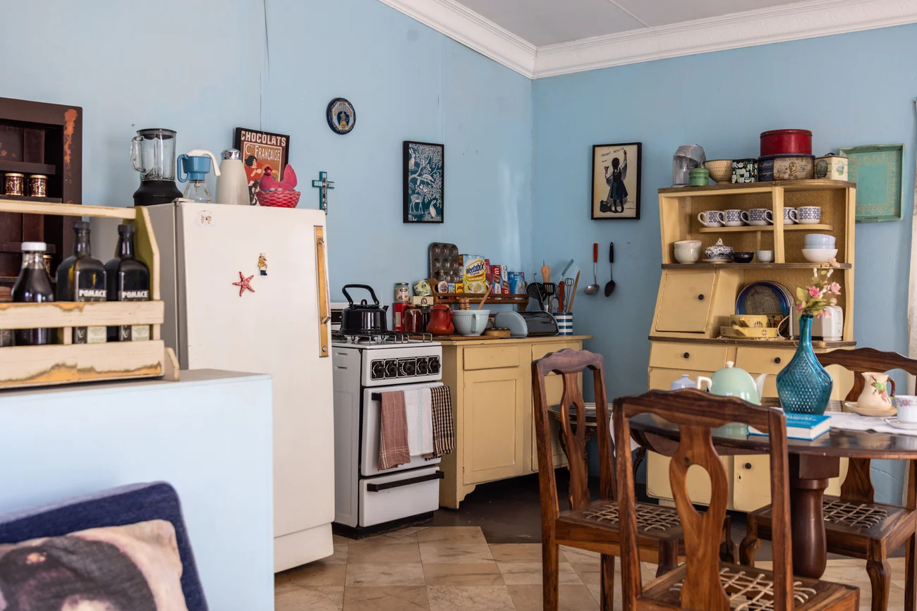
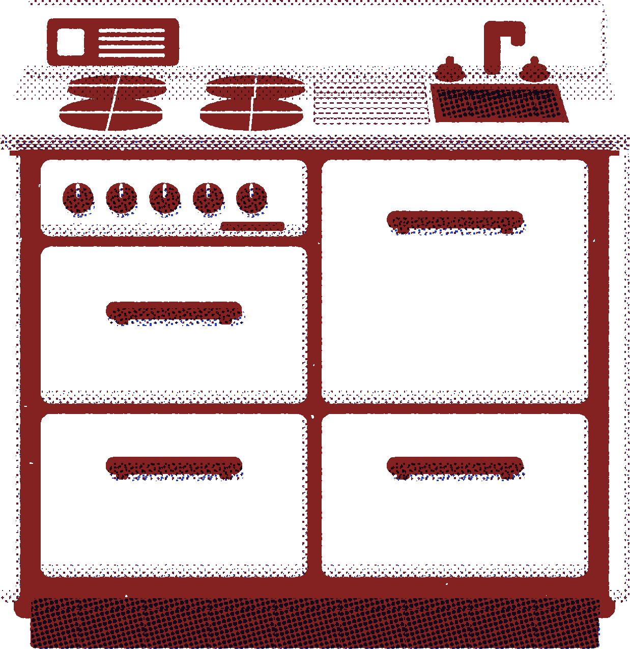
The Little Range takes its shape from old freestanding cookers, with their raised backs, softened corners and rows of knobs. Drawing it this way brings that 1950s shape together with a printing process that became an office machine in the 1980s. I like the mix, even if the dates don’t match.
The colours are what make it feel at home here. A red handle against a cream door is already a big part of the kitchen’s character, and those same colours work beautifully as broad areas of ink.
Strong silhouettes suit this sort of riso drawing. Reducing the Little Range to a few shapes and ink layers gave me a useful test: the raised back and softened corners still read as our little kitchen.
I’d hoped to make something you could recognise at a glance. Seeing it hold together in these prints makes me unreasonably pleased.
“You can tell a little
about how the thing was made
just by looking at it.”
Back at the workbench.
In the plywood story, I wrote about leaving the layers visible at the edge of the kitchen. I’m drawn to those edges for much the same reason I like seeing the dots in a print: you can tell a little about how the thing was made just by looking at it.
Bonza began with furniture I was making for my own children. Taking time over an edge or a proportion was part of the pleasure of it, and I’m trying to bring that same care to the Little Range here in Sydney. I want to keep coming back to the details until they feel right in a child’s hands.
I expect the kitchens in a small batch to have their own little differences too, much like a run of prints. The grain will vary where the timber shows, and hand finishing can leave small variations from one piece to the next. That’s part of the appeal for me.
I hope the time spent making it leaves room for a child to take their time with it, too. They might turn a knob, check on an imaginary dinner and decide it needs another minute. There’s enough of a kitchen to get a game going, and plenty left for them to make up.
Perhaps they’ll notice the smaller things along the way: the stripes in a plywood edge, a colour they’ve claimed as theirs, or the dots making a shadow in a print on their wall. I’d love to hear what they notice.
Our illustrations are digital, built from separate ink layers, dot screens and small shifts in alignment using Bonza’s colours. The print room below lets you play with those same layers and make a poster to keep.
If there’s a small person beside you, let them have a turn at choosing the colours. I’m curious to see what you make.

Sources, credits & further reading History, process & image licences
Research checked in September 2026. I’ve made the dots bigger and the colour shifts more obvious in the studies above, simply so they’re easier to see. A real print would come out a little differently. Photo credits and licences are noted beside each image.
- A small print shop in Tokyo RISO — the founding of Riso-sha and the development of RISO INK
- From the RISO-GRAPH to the RISOGRAPH RISO — machine history, including the 1958 stencil device
- The first RISOGRAPH machines RISO — 1980 launch, the 1984 all-in-one and the 1986 digital model; Japanese release dates
- Inside the printing process RISO — masters, drums and automated stencil printing
- Colour, screens and paper RISOTTO Studio — a working print studio’s guide to translucent inks, halftones and print settings
- Getting the layers to meet Risograph Lab — spot colours, registration and two-drum printing
- The print studio today RISOTTO Studio — an independent risograph studio, established in Glasgow in 2012
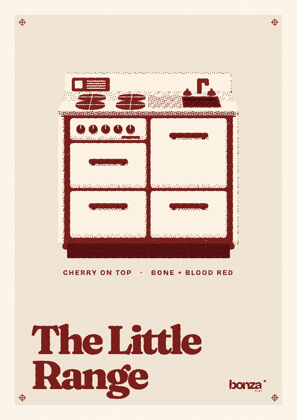
Make it yours.
The Little Range as a riso-style poster. Pick your colours, change the screen, then take it home.
We hope to tuck a poster in with every Little Range.